The morning
It tells you what to do before it tells you how much.
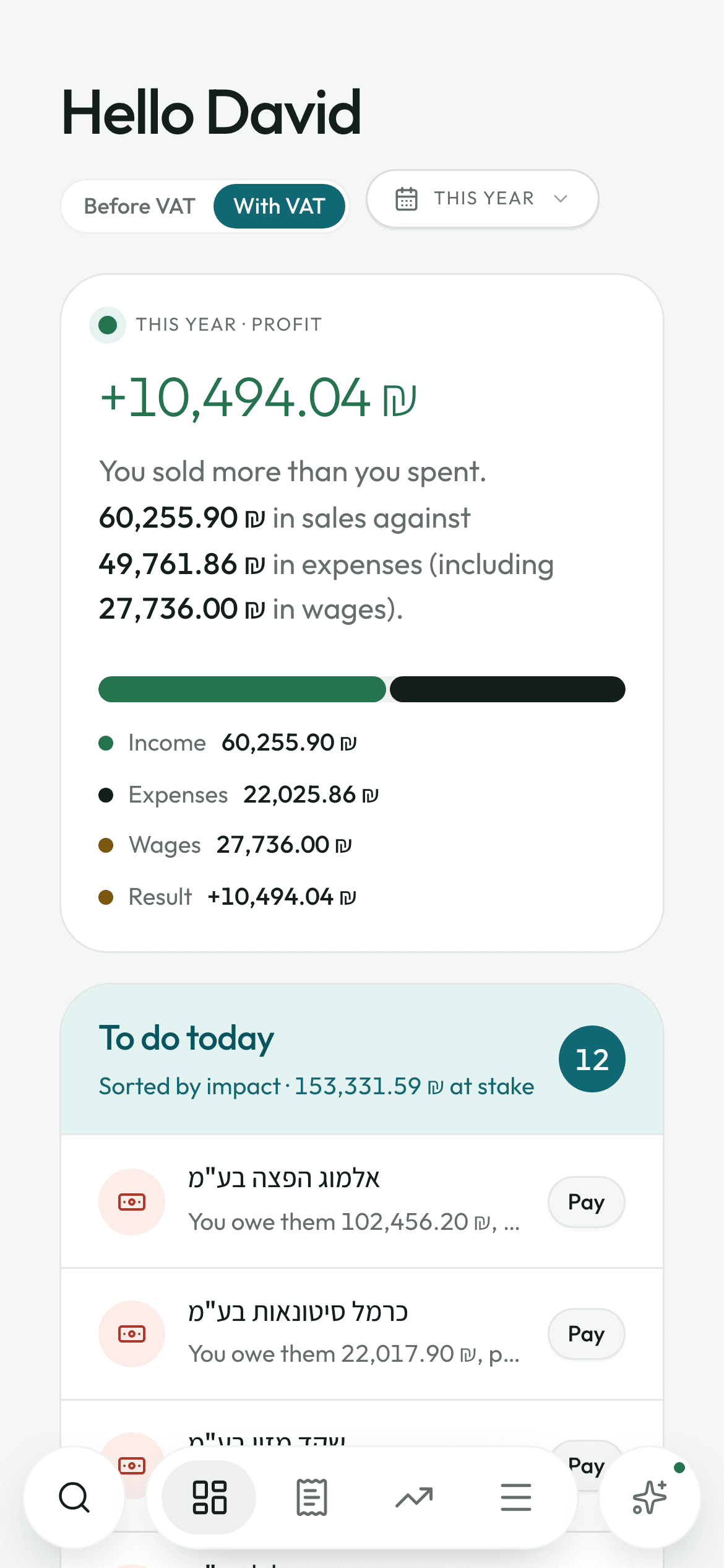
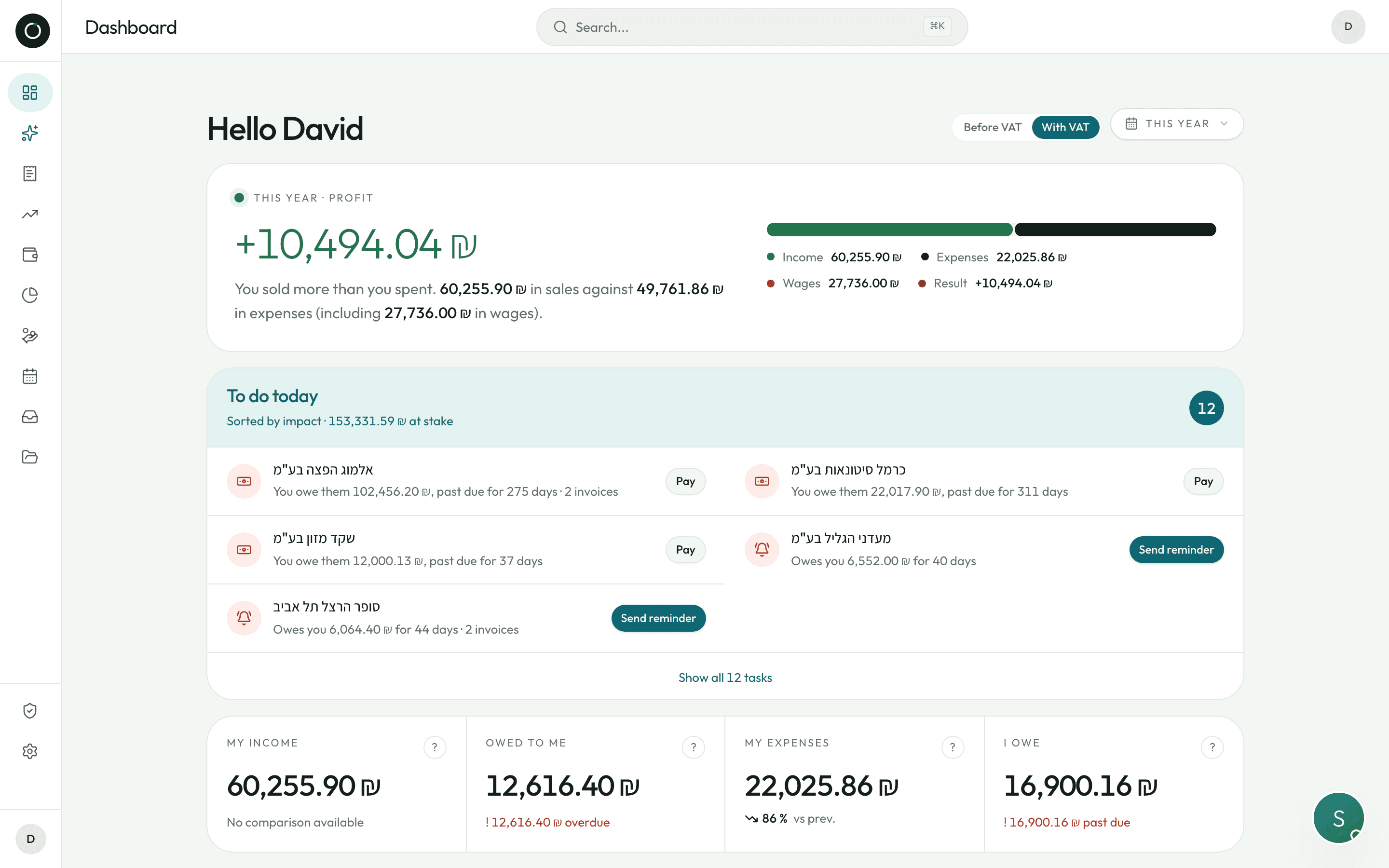
At the top, one big amount: what you sold minus what you spent, wages included, with a sentence that explains it in plain words. Right below it — before any of the figures — the “To do today” card, sorted by what each item is worth in shekels, with the button sitting next to every line.
What to do today, before the figures
You open the app with three minutes to spare. The first thing you see is not a table: it is a list of things to do, sorted by how much money each one is worth, with the total at stake.
- Every line has its own button: Chase, Pay, Check, View, Sort out, Add
- Chasing a late customer opens WhatsApp with the message already written in Hebrew: their name, the balance still owed, the number of days. 0501234567 turns into 972501234567 on its own. You are the one who presses send
- Paying a supplier opens the payment window right there, without leaving the screen
- A customer who has paid more than they owe comes up by itself, with the amount overpaid
- A rise in a buying price comes up with the figure attached: “Purchase price +12% · ₪340 more a month”
- Nothing to do? A big green tick, and “Nobody owes you money that is late, nothing has fallen due, all your documents are filed”

Here is what matters today, in order.
The four figures, and the “?” that explains them
My income · Owed to me · My expenses · I owe. Each one has its own small “?” that opens a plain-language explanation — and under “Owed to me” and “I owe”, the overdue amount, with the name of the customer or the supplier who weighs the most.
- “Owed to me = the money your customers have not paid yet: invoices − credit notes (זיכוי) − payments already made”
- Under “Owed to me” and “I owe”, the amount that is genuinely overdue shows in red — or the line that feels good: “Nothing overdue”
- Both boxes are clickable and take you to the Customers and Suppliers lists
- The big figure at the top: what you sold minus what you spent, with wages counted at their full cost to the employer
- A bar in two colours shows the share of what comes in and what goes out
- A before-VAT / with-VAT switch, so your figures match your accountant's; it remembers your last choice
Eleven periods, and a comparison that does not talk nonsense
Today, yesterday, this week, the last 7 days, this month, 30 days, last month, 90 days, this year, last year, since the beginning — plus two dates of your own. It is all worked out on the device: the figures change straight away, even on 4G.
- Every figure is set against the period before it. When that comparison means nothing, the app writes “No comparison possible” instead of some wild percentage
- A rise in expenses is never shown in red: more often than not, it simply means you are selling more
- You cannot pick a date in the future, and two dates the wrong way round are put back in order
- The same picker behaves the same way on nine screens of the app
- “Today” is always worked out on Israeli time, whatever the server or the phone says
- The period is written into the page address: reload, and you land back on the same figures
The calendar: what goes out, what comes in, seven days ahead
One figure at the top: what is due in minus what is due out over the next seven days. “You have ₪4,200 going out and ₪6,900 coming in by 14 Sept. You will still have enough to pay.”
- The calendar does not only show the payments you have already entered: it also shows the due dates of unsettled invoices, with the amount left to pay and the days overdue
- A red block at the top lists every missed due date, whatever the month — something overdue since March is still in sight in September
- One cheque that settles three invoices appears only once: “Cheque no. 1234 · 3 invoices”
- On a phone: the month grid with a dot on each day, then a running list — “The next 7 days / Later this month / Days gone by”
- On a computer: the amounts inside the cells, a total for each week, and the day itself laid out in a panel on the right
- Open a day and you get its balance, every movement, and a “Mark everything settled” button
Where my money goes
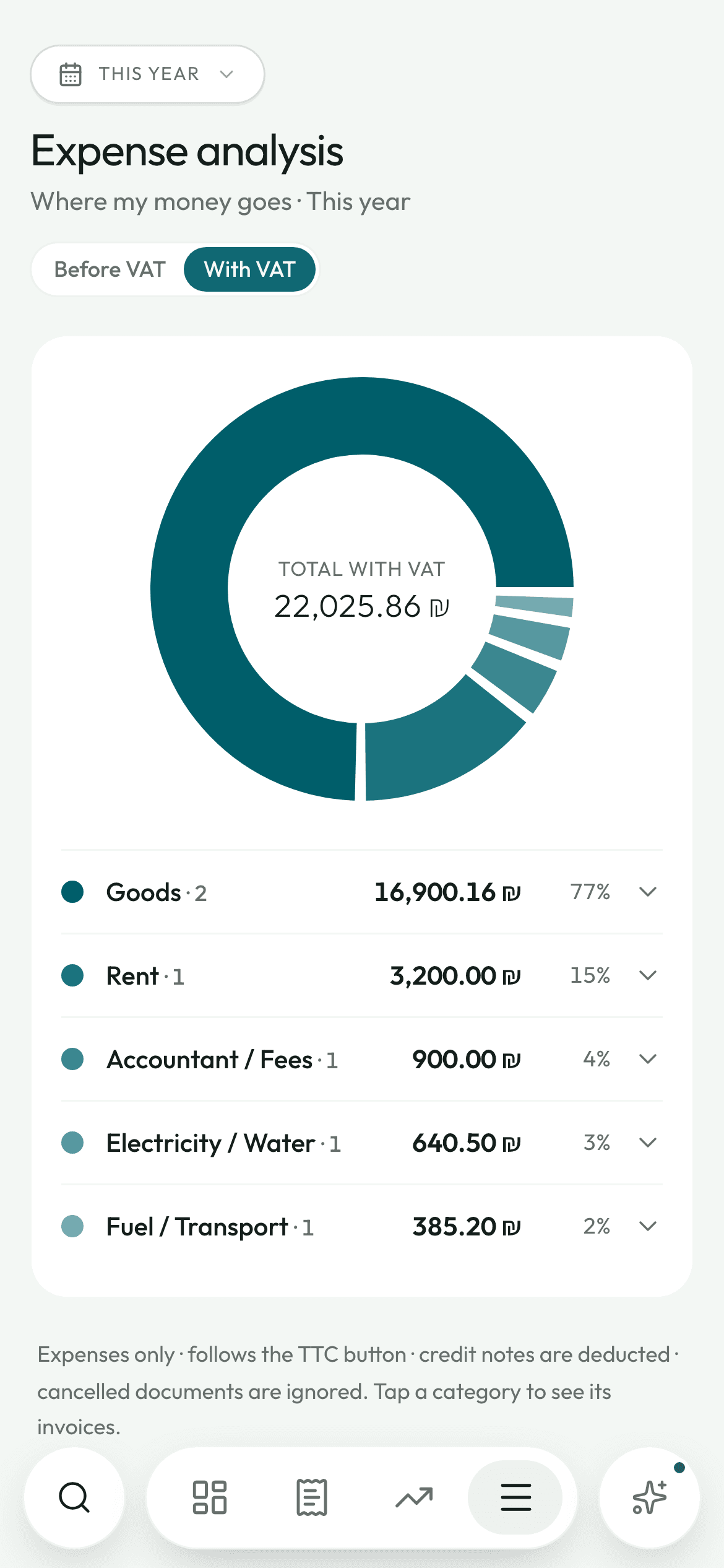
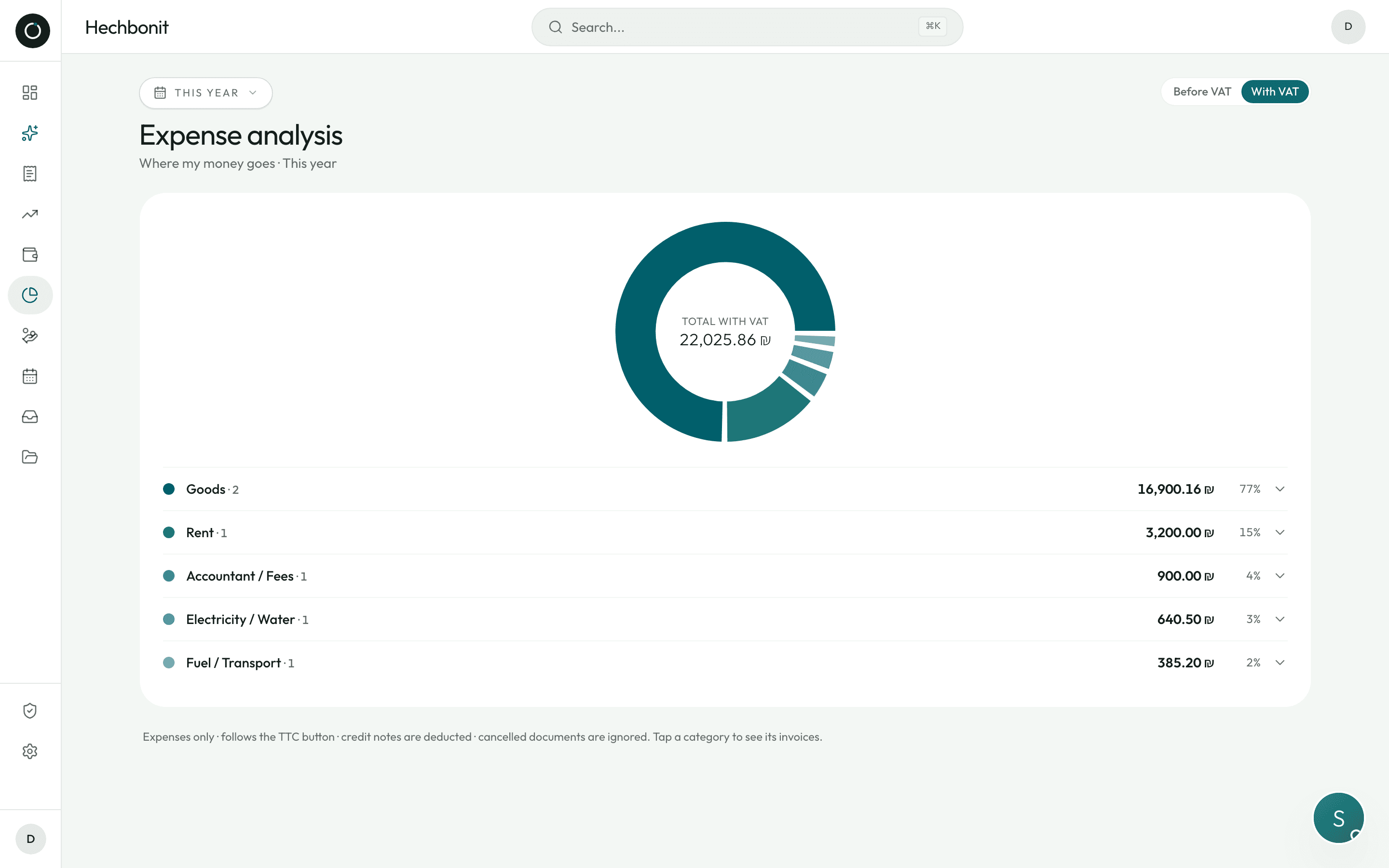
A page of its own draws your expenses by category as a ring, over the period you chose, with the total in the middle. Underneath the ring, the list: colour dot, name, number of invoices, amount and percentage.
- Goods, Rent, Electricity/Water, Fuel/Transport, Insurance, Accountant, Marketing… or a category you make up yourself
- Each slice opens onto its invoices, the most recent first, every one of them clickable
- Credit notes are deducted, cancelled documents ignored, and “No category” stays in grey right at the bottom
- You pick the category when you bring the expense in — the only extra move, and it is asked once, on the invoice itself
- No red in the chart: spending money is not a problem, red is kept for real alerts
Good to know
- An orange banner when Z reports (דוח Z) are missing — and the app works out your opening days from your own history.
- “Latest documents”: expenses and income in a single list, with the right sign on credit notes.
- “Upcoming payments”: the next five, with a “Settled” button to tick off a cheque that has cleared, straight from the dashboard.
- A guided tour walks you through the screen the first time you log in, and starts again whenever you want it from Settings.
- Global search: ⌘K on a computer, the magnifier on a phone — expenses, income, suppliers, customers and the products you buy.
- If one block of data does not answer, the page still comes up: at worst one box is empty, the rest works.
Try it on your own real invoices.
Create my account14 days on us · No credit card